Integrating the Pupau Web Component into Your Website: A Practical Guide
The Pupau Web Component is a cutting-edge tool that seamlessly adds AI chat functionality to your website. Leveraging the power of Web Component standards, this solution offers a uniquely accessible and versatile integration process.
Web Components are a set of standardized web platform APIs that allow you to create reusable, encapsulated HTML elements. The beauty of this technology lies in its universality – Web Components work across modern browsers and can be used with any JavaScript library or framework.
By utilizing this standard, the Pupau Web Component brings several key advantages:
- Framework Agnostic: Whether your site is built with React, Angular, Vue, or plain PHP or HTML, the Pupau component will integrate smoothly without conflicts.
- Encapsulation: The component’s functionality is self-contained, meaning it won’t interfere with your existing code or styling.
- Simplicity: Integration requires minimal code, often just a single line, dramatically reducing the technical barrier to entry.
- Customization: Despite its simplicity, the component offers robust customization options to match your site’s look and feel.
- Future-Proof: As a standard technology, Web Components ensure long-term compatibility and support.
The true power of the Pupau Web Component lies in its ability to bring advanced AI chat capabilities to your website without requiring extensive technical knowledge. Whether you’re a seasoned developer or a business owner with basic web skills, you can enhance your user interaction with just a few simple steps.
In the following sections, we’ll guide you through the process of integrating this powerful tool into your website, demonstrating how Pupau has made adding AI functionality as simple as inserting a custom HTML tag.
Step 1: Obtaining the API Key
An API Key is needed to authenticate the requests coming from the Web Component in your application. Getting it is a straightforward process:
- Log in to your Pupau Web App account.
- Navigate to your assistant’s configuration page. Remember, you can only integrate assistants created in your account or organization.
- Go to the “Clients and Integrations” section.
- Click on “Create a new API Key”.
- In the configuration screen:
- Adjust UI options to match your website if desired.
- Set any access restrictions to enhance security.
- Generate and save your API Key.
For more information about the API Key, please refer to the Clients and Integrations page.
Step 2: Inserting the Web Component into Your Site
The following code should be inserted in the desired section of your HTML, typically before the closing </body> tag.
<script src="https://cdn.pupau.ai/pupau-assistant/stable/integrations/latest.js"></script>
Once this code is added, you can use the Web Component by inserting the pupau-assistant custom tag into any container that makes sense for your use case, configured with the previously generated API Key:
<div id="your-container">
      <pupau-assistant api-key="YOUR-API-KEY"></pupau-assistant>
</div>
Step 3: Testing and Advanced Customization
Run your website/application in a browser and you will see the Web Component appear. Depending on the API Key UI configuration, the Web Component may appear as a button in the bottom-right corner of the page or as a chat window.
Among the configuration options, pay special attention to the “Expand chat in the Container” setting. This option is crucial as it determines how the Web Component will appear on your website:
- When disabled: The chat assistant appears as a closed button. Users need to click this button to start a conversation.
- When enabled: The chat assistant is displayed as an open chat window within your designated element container. This setting allows you to choose between a more subtle, button-based approach and a more prominent, immediately accessible chat interface. Consider your website’s layout and user experience goals when selecting this option.
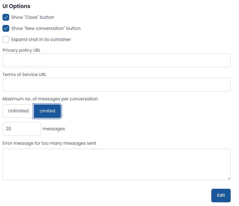
Another important configuration option to consider is the “Message Limit per Conversation”. This feature allows you to:
- Set a maximum number of interactions a user can have with the assistant in a single conversation.
- Prevent potential misuse, especially when the assistant is available to non-authenticated users.
By implementing this limit, you can:
- Control usage and resource allocation
- Encourage more focused interactions
- Reduce the risk of automated abuse This option is particularly valuable for public-facing assistants or when you want to ensure fair access for all users. Consider your use case and adjust this setting to balance accessibility with security.
Marketing Tools
Pupau doesn’t just stop at providing an Assistant; it also offers powerful marketing tools to enhance your customer engagement and lead generation efforts. To access these features:
- Go to the configuration area of your assistant.
- Select “Marketing Tools” from the menu.
Here, you can set up two key features:
a) Customizable Contact Form:
- Design a form that users must complete before interacting with the assistant
- Tailor the fields to collect the information most valuable to your business
- Create a seamless transition from initial contact to AI interaction
b) Lead Notification System:
- Configure how you receive alerts about new leads and contacts
- Ensure prompt follow-up on potential business opportunities
- Integrate with your existing CRM or notification systems
These marketing tools transform your AI assistant into a dual-purpose powerhouse:
- Enhanced User Experience: Visitors enjoy personalized, AI-driven interactions
- Lead Generation: Simultaneously collect valuable contact information and insights
By leveraging these features, you’re not just providing support; you’re creating a dynamic channel for business growth. The AI assistant becomes an active participant in your marketing funnel, engaging users while gathering crucial data for your sales and marketing teams.
Remember to balance data collection with user experience. Keep your contact form concise and relevant to maintain high engagement rates with your AI assistant.
Optional Web Component Parameters
In addition to the required api-key attribute, the pupau-assistant tag supports optional parameters to customize behavior and context.
-
custom-properties: object with optional information to pass into the agent context (e.g., user data, preferences, UTM). When used as an HTML attribute, provide a valid JSON string; in JavaScript you can set the
customPropertiesproperty.- HTML attribute example:
<pupau-assistant
  api-key="YOUR-API-KEY"
  custom-properties='{"userId":"1234","plan":"pro","utm":{"source":"website"}}'>
</pupau-assistant> -
lang: UI language code used to contextualize the UI and assistant responses. Accepted values:
it-IT,it,en-EN,en-US,en,es-ES,es,fr-FR,fr,pl-PL,pl,sq-AL,al,de-DE,de,nl-NL,nl,tr-TR,tr,ko-KR,ko,zh-CN,zh,hi-IN,hi,pt,pt-PT,sv,sv-SE. If omitted, the browser language or the API Key configuration is used.<pupau-assistant api-key="YOUR-API-KEY" lang="en-US"></pupau-assistant> -
mode: controls the component rendering. Allowed values:
FULLorFLOATING.FULL: renders inside the container and fills the available space.FLOATING: forces the floating/launcher window mode as configured by your API Key (launcher and position).- If not specified, behavior follows the UI configuration defined in the API Key.
<pupau-assistant api-key="YOUR-API-KEY" mode="FULL"></pupau-assistant>
Tip: when using mode="FULL", ensure the container element has adequate height to display the chat properly.
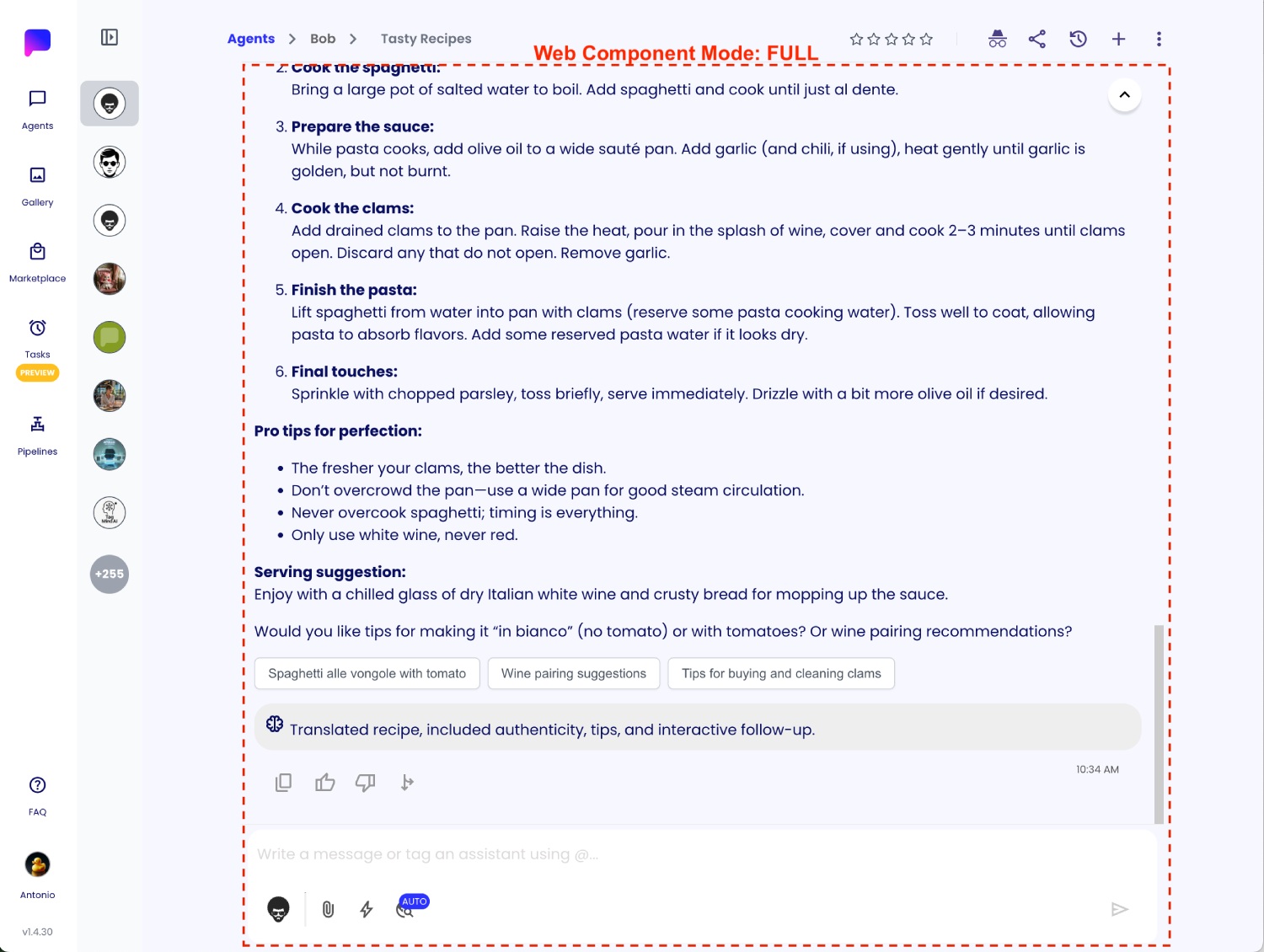
Mode Full will expand the Web Component in the container.
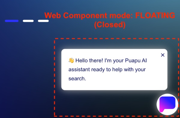
Mode Floating will render a floating button according to the Web Component settings. The Web Component will start closed, and it can be opened by clicking it.
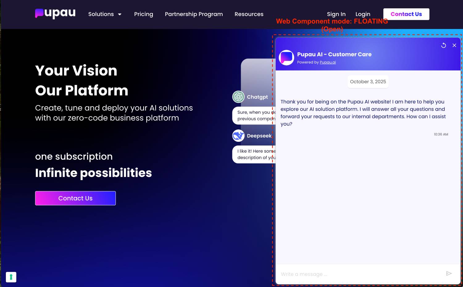
Mode Floating renders the Web Component when open.